4. Visualize Data with Looker Studio
The final step is to unlock the value in our data by creating an interactive dashboard. Looker Studio (formerly Google Data Studio) is a free tool that turns your data into informative, easy to read, and easy to share dashboards.
Prerequisites
- A Looker Studio account (lookerstudio.google.com).
- Your BigQuery table containing data.
- A Looker Studio Dashboard Template to copy.
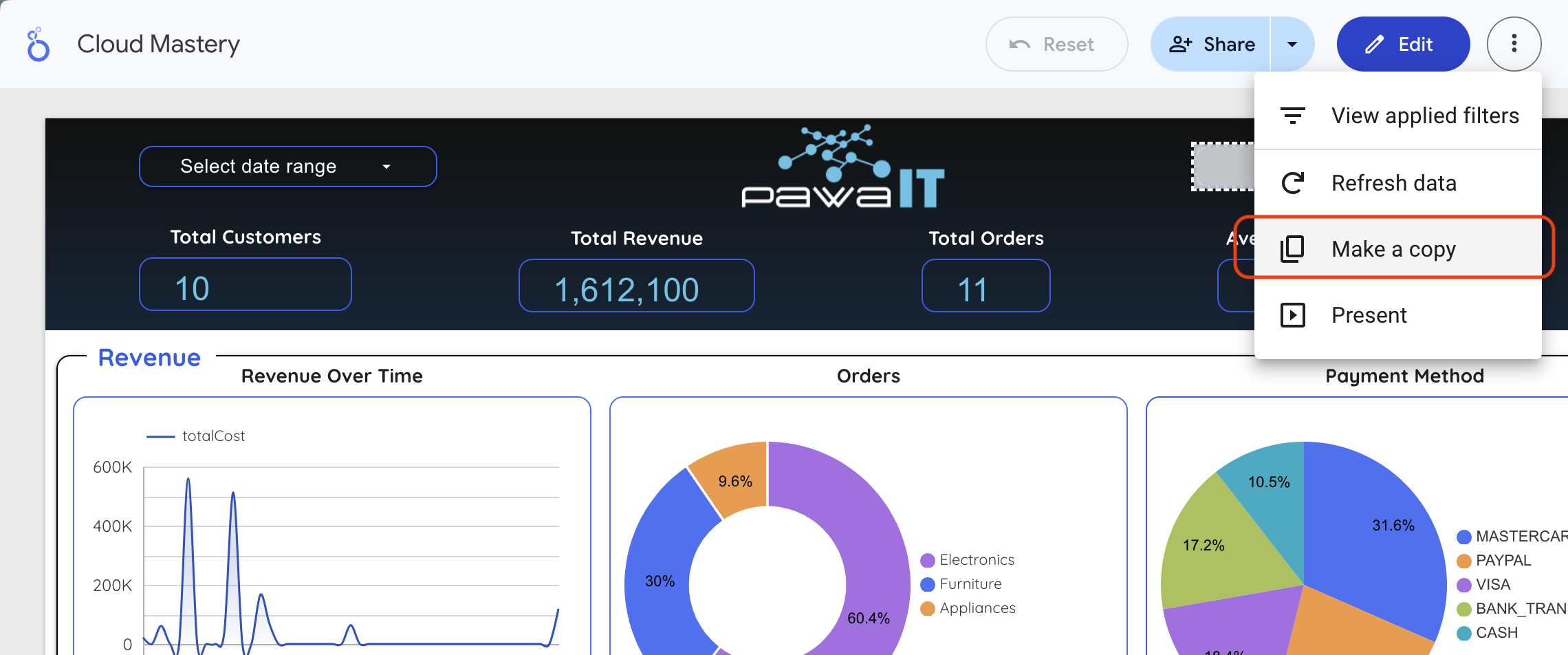
Step 1: Copy the Dashboard and Connect to Your Data
- Open the provided Looker Studio report template.
- In the top-right corner, click the three-dot menu (⋮) and select Make a copy.
- In the "Copy this report" window, under the New Data Source column, click the current data source to change it.
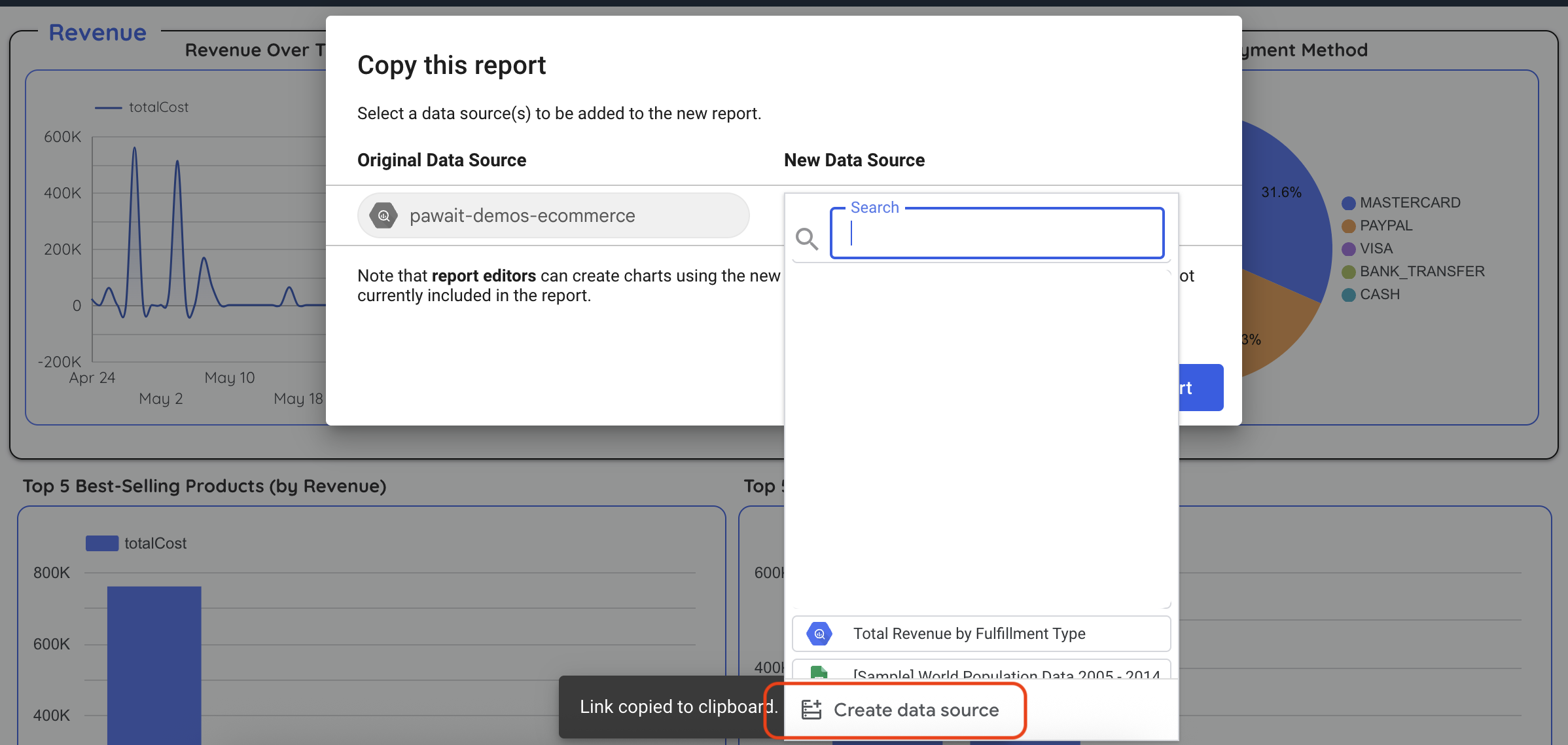
- In the panel that opens, click CREATE DATA SOURCE at the bottom.
- Select the BigQuery connector.
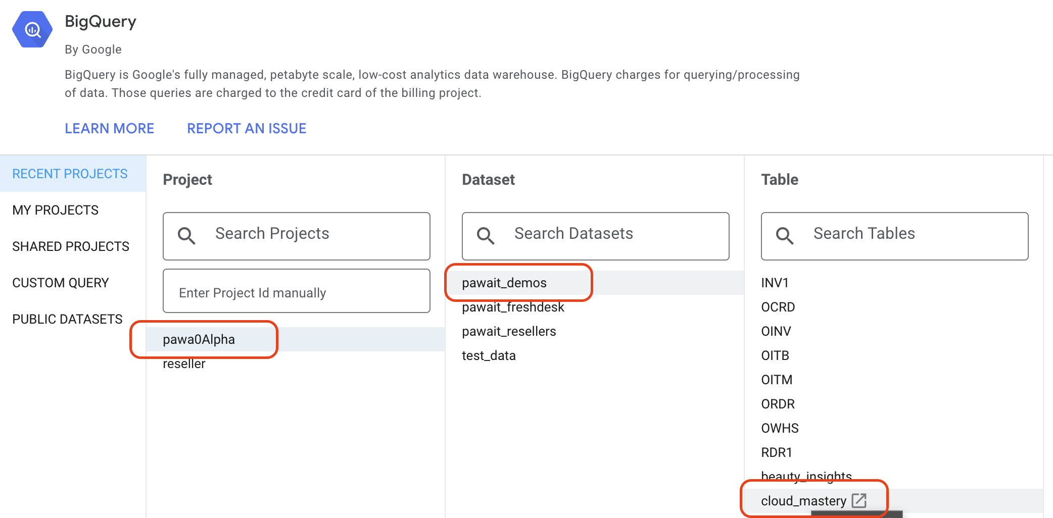
- Navigate through the hierarchy: Your Project >
cloud_masteryDataset >denormalized_ordersTable. - Click CONNECT in the top-right.

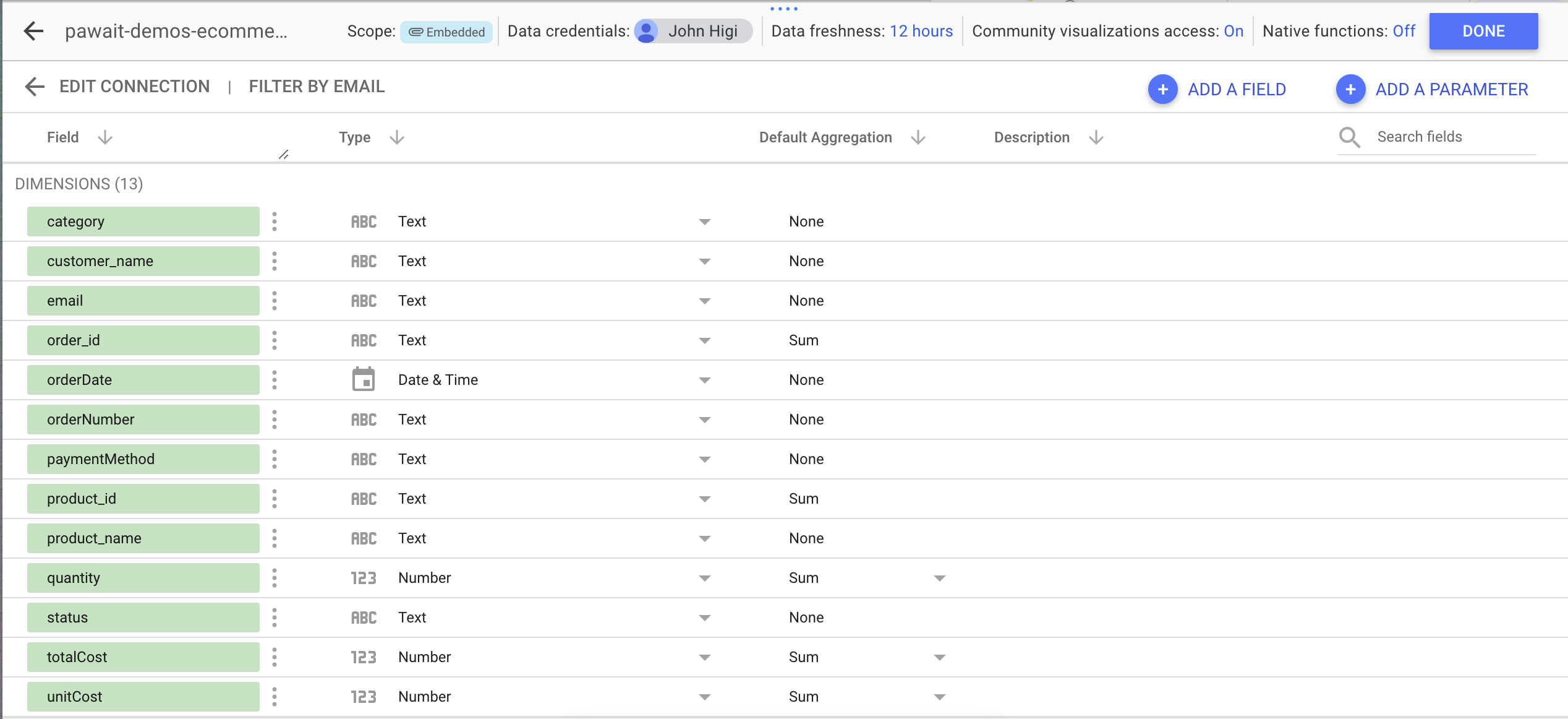
- Looker will show you the table schema. Click ADD TO REPORT.
- You'll be back at the "Copy this report" window. Confirm your new data source is selected and click COPY REPORT.
Your dashboard copy will now load, powered by your own BigQuery data.
Step 2: Add a Calculated Field
Let's create a new field directly in Looker Studio without altering our BigQuery table. We'll group detailed order statuses into simpler categories.
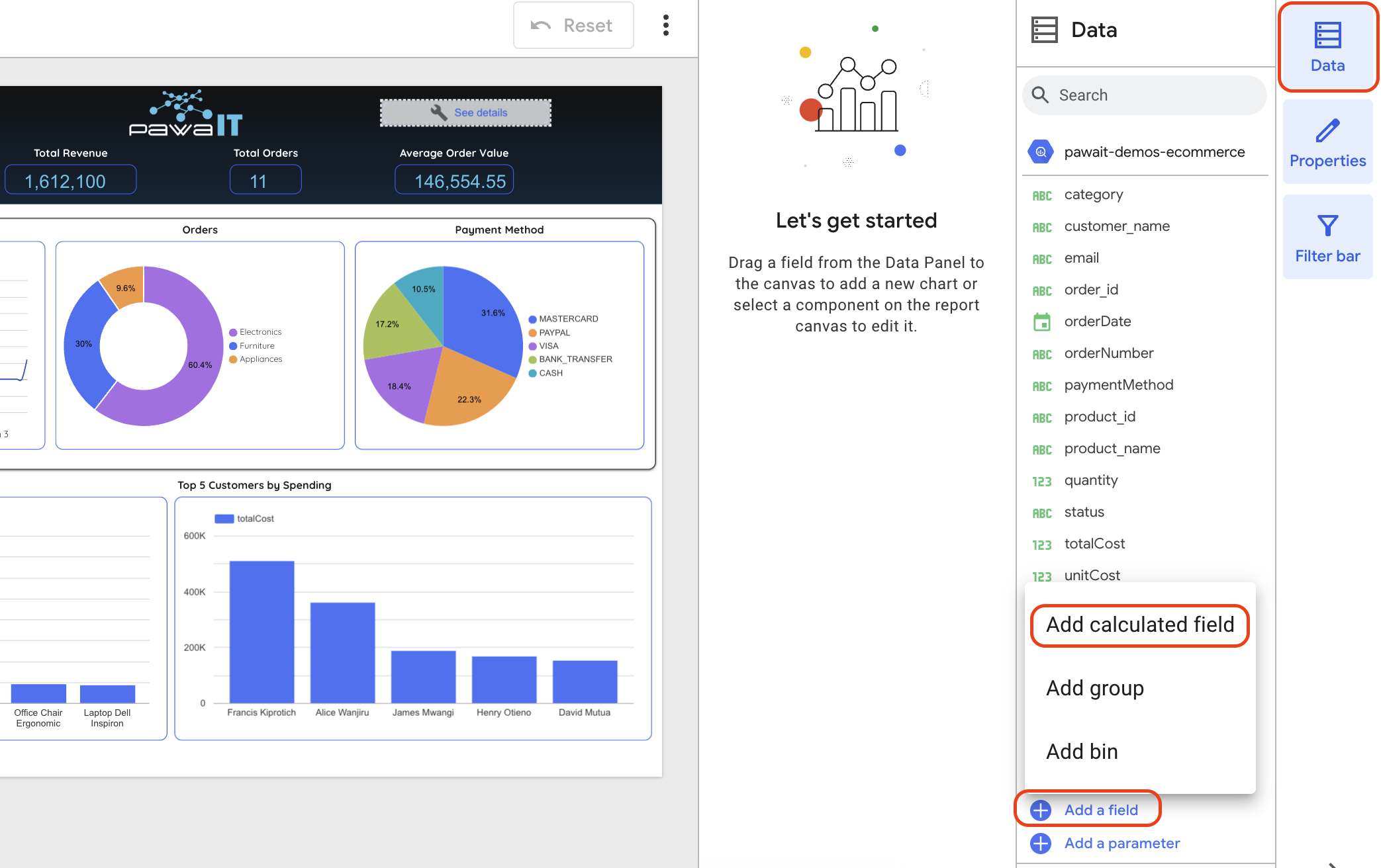
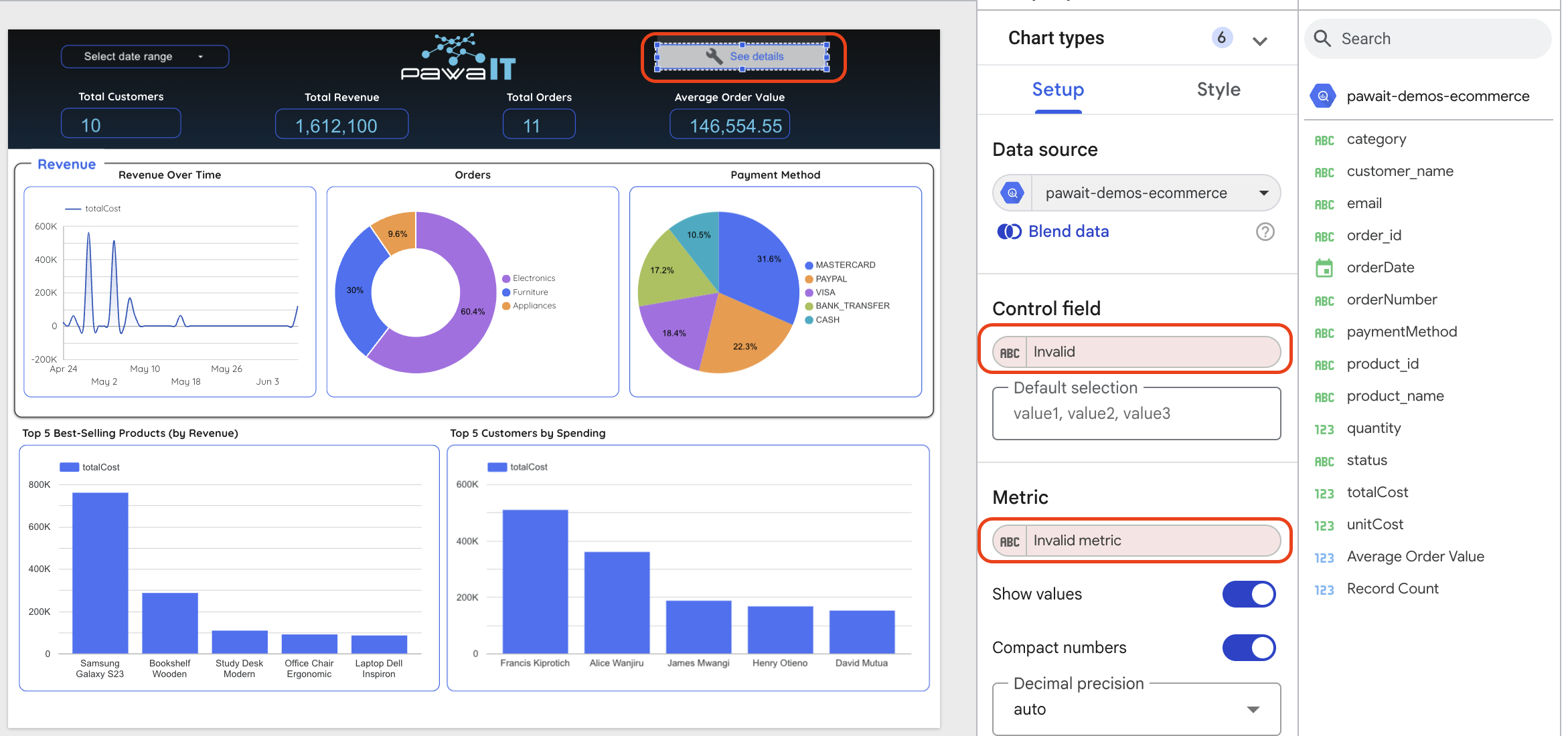
- In your new report, go to the menu Resource > Manage added data sources.
- Find your
denormalized_ordersdata source and click EDIT. - In the top-left of the data source editor, click + ADD A FIELD.
- Configure the new field:
- Field Name:
Order Status Group - Formula:
-- This formula groups detailed statuses into broader categories.
CASE
    WHEN status = 'Delivered' THEN 'Completed'
    WHEN status = 'Shipped' THEN 'Completed'
    WHEN status = 'Processing' THEN 'In Progress'
    WHEN status = 'Pending' THEN 'In Progress'
    ELSE 'Other'
END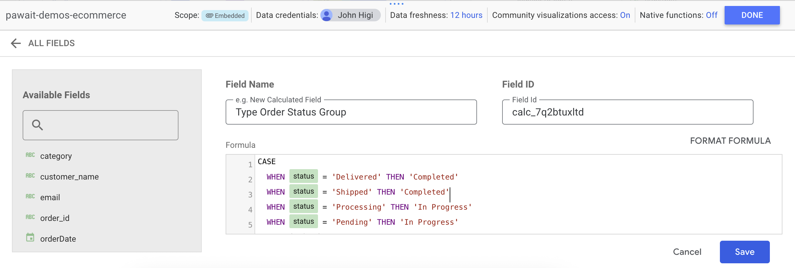
- Field Name:
- Click SAVE. Then click DONE in the top-right to return to the report.
Step 3: Use the Calculated Field in a New Chart
- In the top menu, click Add a chart and select Pie chart.
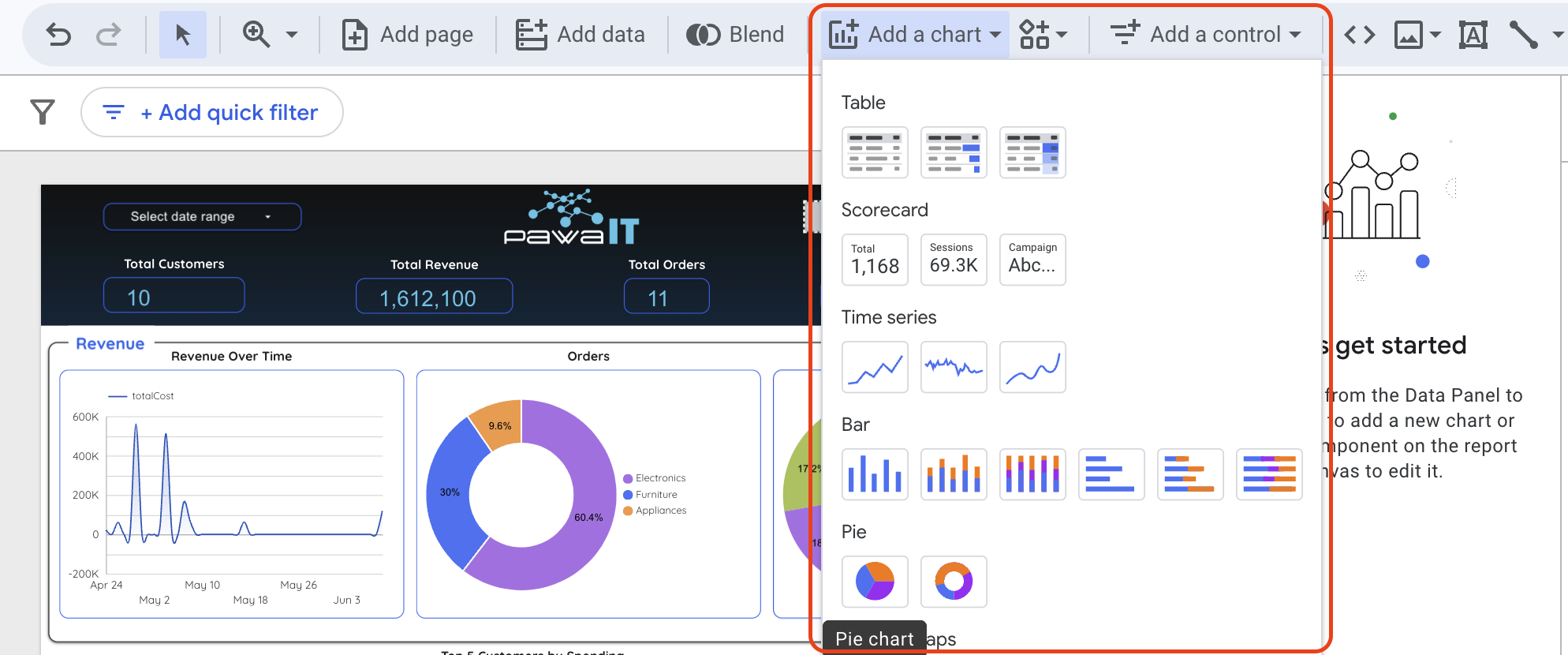
- Click on the report canvas to place the chart.
- With the new chart selected, configure its Setup panel on the right:
- Dimension: Drag your new
Order Status Groupfield here. - Metric: Drag the
order_idfield here and set its aggregation to Count Distinct (CTD).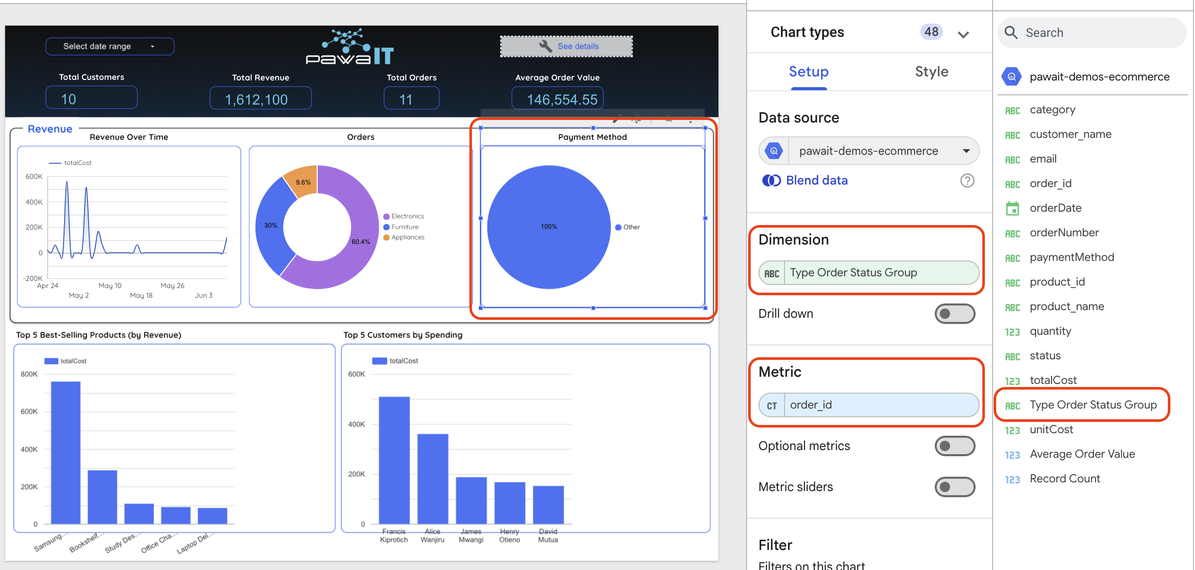
- Dimension: Drag your new
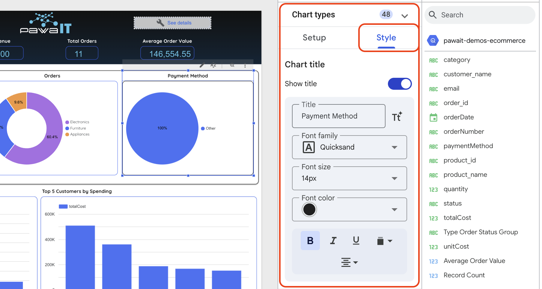
- Use the Style tab in the right-hand panel to customize its appearance.
Lab Complete!
You have successfully built an end-to-end data pipeline, from raw data in MySQL to an automated data warehouse in BigQuery, and finally to an interactive dashboard in Looker Studio.